
Pivot tables are one of the most useful tools for turning large spreadsheet datasets into understandable summaries. A properly designed pivot table can reveal sales trends, compare departments, summarize customer activity, or identify unusual patterns without requiring a separate formula for every calculation.
Basic pivot tables are easy to create, but their real value becomes more apparent when you use advanced techniques for grouping, filtering, calculated values, and multi-level analysis. These features can help transform a long list of records into a flexible analytical tool while keeping the underlying data intact.
Advanced pivot table analysis depends on the quality of the source data. Before creating a pivot table, make sure each column has a clear heading and represents one type of information. For example, a sales dataset might contain fields for order date, customer, region, product, quantity, revenue, and sales representative.
Avoid combining multiple records into a single cell or leaving inconsistent values in category fields. If one region is recorded as "West," "WEST," and "Western," a pivot table may treat them as separate categories.
Dates also need special attention. A column containing a mixture of true spreadsheet dates and text that merely looks like dates can prevent useful grouping and time-based analysis.
For frequently updated datasets, converting the source range into a structured table can make the workflow easier to maintain because newly added records can be incorporated more reliably into subsequent analysis.
One of the most useful advanced pivot table techniques is grouping.
Suppose a dataset contains thousands of individual transaction dates. Displaying every date separately may produce an unnecessarily long report. Grouping dates by month, quarter, or year can provide a much clearer view of performance over time.
For example, instead of analyzing:
January 3
January 4
January 5
January 6
you can summarize transactions by month or quarter. This makes it easier to identify seasonal changes and longer-term trends.
Grouping can also be applied to numerical values. If customer ages range from 18 to 80, for example, you could organize them into ranges such as 18–29, 30–39, 40–49, and so forth.
The choice of grouping interval should reflect the question being investigated. Very narrow groups may preserve too much detail, while very broad groups can hide meaningful differences.
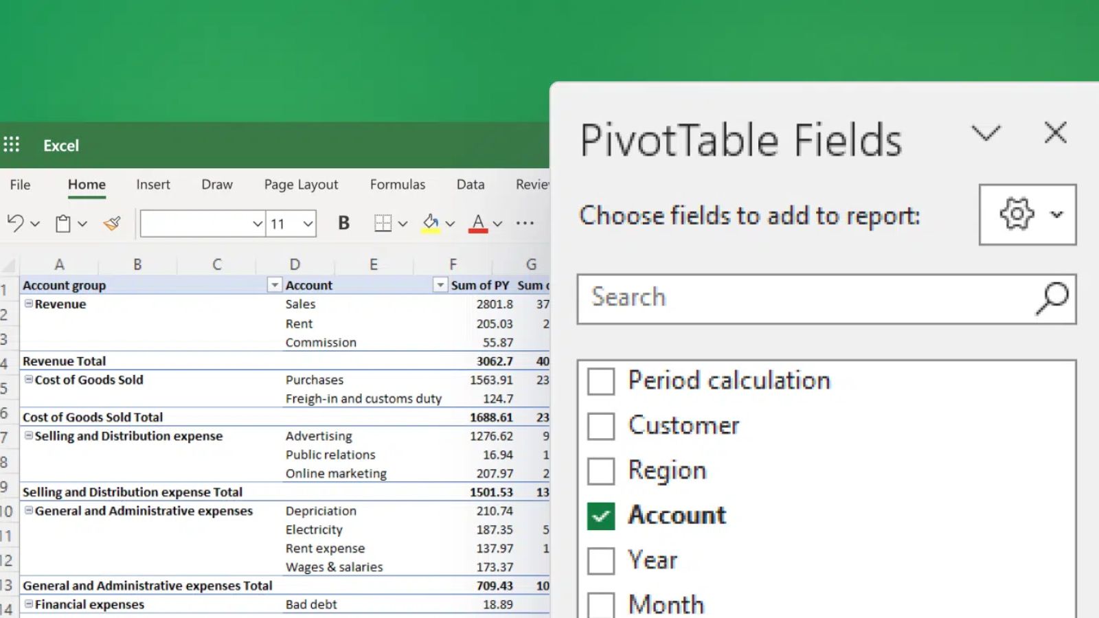
A pivot table becomes considerably more informative when related fields are arranged in a hierarchy.
Imagine a sales dataset containing region, state, city, and product category. Rather than creating separate reports for each level, you can place these fields into the row area to create a drill-down structure.
A reader might first see:
West Region
Then expand it to view:
California
Nevada
Oregon
and continue into more detailed categories where appropriate.
This approach allows one pivot table to provide both a high-level summary and a more detailed view.
The same principle can be applied to dates, products, organizational units, or customer segments. However, too many nested fields can make a pivot table difficult to read, so include only levels that support a meaningful analysis.
Many users rely exclusively on the default Sum calculation. Advanced analysis often requires several ways of looking at the same field.
For example, a revenue field might be summarized using:
Sum to show total revenue
Average to show typical transaction value
Count to show the number of transactions
Maximum to identify the largest transaction
Minimum to identify the smallest transaction
These calculations answer different questions.
A region with high total revenue might simply have a large number of transactions. Comparing total revenue with average transaction value can provide additional context and help distinguish volume-driven performance from unusually large transactions.
When using averages, remember that an average can conceal variation. Two departments may have the same average order value while having very different distributions of individual transactions.
Raw totals are useful, but percentages can make comparisons easier.
A pivot table can display values as percentages of a grand total, row total, column total, or other relevant comparison. For example, if a company generated $2 million in annual sales, showing each region's contribution as a percentage of total sales can make the relative importance of regions immediately visible.
Percentage views are especially useful when categories differ greatly in size.
However, percentages should not replace absolute values when scale matters. A region responsible for 5% of sales could represent either a small business unit or a significant operation depending on the organization's total revenue.
Using both absolute and relative measures often provides a more complete picture.
Large pivot tables can contain hundreds of categories. Filters allow users to focus on a particular subset without changing the source dataset.
For example, a sales analyst might filter the report to:
One fiscal year
A specific region
Selected product categories
A particular sales representative
In spreadsheet applications that support slicers, these controls can make filtering more visible and intuitive. Instead of opening a field menu, users can select a category directly from the slicer.
Slicers are particularly helpful in dashboards and recurring reports because users can see which filters are active. This reduces the risk of interpreting a filtered report as though it represented the entire dataset.
Calculated values can extend pivot table analysis beyond simple aggregation.
For example, if a dataset contains revenue and cost, a calculated measure can help analyze gross profit or margin rather than requiring those values to be manually calculated outside the pivot table.
The exact capabilities and terminology vary between spreadsheet applications and versions, so it is important to understand how the particular tool handles calculated fields, calculated items, and data-model measures.
More importantly, calculations should have clearly defined business meanings. A formula for "profit margin," for instance, should use an agreed definition and denominator. Otherwise, two reports can display numbers labeled "margin" while actually measuring different things.
A powerful pivot table can reveal relationships between two or more dimensions.
Suppose you want to understand product performance by region. Putting regions across columns and products down rows creates a matrix that makes differences easier to compare.
You might discover that:
Product A performs strongly across most regions.
Product B generates high sales in one region but limited sales elsewhere.
Product C has relatively low volume but a high average transaction value.
This type of cross-tabulation is one reason pivot tables remain useful for exploratory analysis. Instead of looking at one variable at a time, you can examine combinations that might reveal patterns hidden in a flat dataset.
Sorting can quickly bring the most significant categories to the surface.
For example, sorting products by total revenue can identify the strongest contributors. Sorting customers by transaction value can highlight major accounts. A top-value filter can narrow the report to the highest-performing categories when the full list is too large to inspect efficiently.
But rankings should be interpreted carefully. A "top 10" list depends on the selected metric and time period. A product could rank highly by revenue while performing poorly by profit margin.
For that reason, advanced pivot table analysis often works best when rankings are combined with at least one supporting measure.
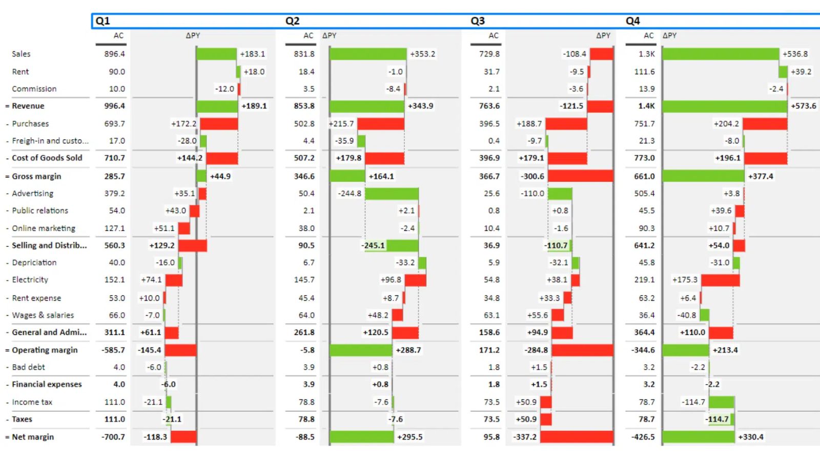
A pivot table is a summary of its source data, not an independent database. When the underlying dataset changes, the pivot table may need to be refreshed before the latest information appears.
For recurring reporting, establish a consistent refresh process and verify that the source range includes the intended records.
Validation is equally important. Pick several categories from the source data and manually reconcile their totals with the pivot table. This can help catch issues involving incomplete source ranges, incorrect filters, duplicate records, or unexpected category values.
A visually convincing pivot table can still produce a misleading result if the underlying data or configuration is wrong.
The strongest use of advanced pivot tables is not producing increasingly complicated reports. It is using flexible summaries to ask better questions.
Start with a broad view, identify an unexpected result, group or filter the data to investigate it, and then drill into the underlying records. For example, a decline in quarterly revenue could lead to a regional comparison, followed by a product-level analysis and finally an examination of individual transactions.
This workflow turns the pivot table from a static summary into an exploratory tool.
The goal is not to display every possible calculation. It is to make large datasets easier to understand, compare, and investigate. When source data is structured properly and advanced features are used with a clear analytical purpose, pivot tables can provide a practical bridge between raw spreadsheet records and meaningful business insights.