
A spreadsheet can easily accumulate hundreds or thousands of individual data cells while still successfully hiding the specific information that matters most to your business or analysis. A comprehensive column of sales figures may harbor a few unusually high or suspiciously low results, a project management tracker can conceal overdue deliverables buried deep among completed items, and a complex corporate budget may hide several expense line items that have quietly breached expected financial limits. Traditional data review requires exhaustive manual scanning, which increases the likelihood of human error and fatigue. Conditional formatting helps bridge this critical gap by automatically bringing these hidden patterns, exceptions, and trends directly into view without altering a single value in the underlying dataset.
Rather than applying a uniform visual style to every cell across an entire worksheet, conditional formatting utilizes dynamic, rule-based logic to alter how cells appear whenever specific criteria are met. Industry software standards, such as those defined in Microsoft Excel documentation, describe conditional formatting as an essential tool designed to make data trends instantly apparent through cell-based rules, visual data bars, graduated color scales, and categorical icon sets. However, the true practical value of conditional formatting does not lie in the colors or graphics themselves. Good conditional formatting translates raw, unorganized questions about a dataset into an immediate visual signal that makes unusual, critical, or actionable values significantly easier to investigate.
The most effective conditional formatting strategy always begins with a clear analytical question rather than a spontaneous color choice. Before establishing a rule, a data analyst or project manager must determine precisely what deserves human attention within the workflow. For instance, a regional sales manager might need to identify customer orders that deviate significantly from historical averages, an educator might need to flag student scores falling below a critical academic threshold, or an inventory coordinator must instantly spot products with stock quantities dropping below safe minimums. Each distinct operational scenario demands a completely different conditional rule structure.
Simple threshold rules represent the most practical starting point for everyday spreadsheet design. A well-constructed spreadsheet can automatically highlight values resting above or below a specified numerical boundary, flag dates approaching a critical deadline, or isolate text strings containing specific keywords. Advanced spreadsheet applications also support built-in rules for detecting duplicate entries or unique data points, which serve as vital safeguards for data hygiene and quality control. The essential distinction here lies between merely interesting data and truly important data. Automatically highlighting the absolute highest numbers in a column may look visually impressive, but it rarely reveals a meaningful business or operational pattern unless framed by context. A truly effective formatting rule must always reflect a specific decision, operational risk, budget exception, or comparative benchmark that an analyst actually needs to understand.
Threshold-based formatting performs exceptionally well whenever there is a meaningful, objective boundary defined within the dataset. Suppose a complex project tracking worksheet contains multiple task completion deadlines. One conditional rule can instantly flag dates that have already passed without completion, while a secondary rule can highlight impending deadlines approaching within a specific warning window. Similarly, an inventory management worksheet can be configured to highlight stock quantities that fall below an automated restocking threshold.
This targeted approach succeeds because it ruthlessly separates routine operational information from urgent exceptions. Instead of forcing a user to manually inspect every single row of data, conditional formatting allows the human eye to immediately focus attention on the values that demand investigation. However, these thresholds must be rooted firmly in the specific context of the dataset rather than arbitrary numbers pulled out of thin air. A sales revenue value of ten thousand dollars might represent an extraordinarily high anomaly for a local boutique while remaining completely insignificant for a multinational retail enterprise. Likewise, a customer service response time of two days might represent an acceptable benchmark for one internal workflow while triggering a critical failure for another. Conditional formatting merely identifies values that satisfy a programmed rule; it can never determine whether the underlying threshold itself makes practical sense. That critical judgment remains the sole responsibility of the human analyzing the data.

Not every meaningful data pattern relies on a rigid, fixed numerical cutoff. In many analytical scenarios, the primary goal is to understand how individual values compare relative to one another across an entire distribution. Graduated color scales are engineered specifically for this purpose, applying a smooth spectrum of colors across a designated range so that the intensity of the visual shading reflects a cell's relative position within that dataset. Standard software frameworks utilize three-color scales to visually distinguish higher, middle, and lower numerical values at a single glance.
This technique proves invaluable when comparing performance metrics across different corporate departments, analyzing monthly temperature fluctuations, evaluating regional sales volumes, or monitoring system response times. The primary advantage is that a color scale delivers an immediate sense of data distribution without requiring the viewer to read and memorize every individual number in the column. A viewer can instantly spot clusters, performance peaks, valleys, and gradual trends. Nevertheless, color scales carry an inherent limitation: relative coloring does not indicate whether a specific value is objectively good or bad. A dataset in which every single performance metric is profoundly poor will still produce a highest-performing value that receives the strongest positive color shading. For that reason, color scales are most powerful when the analytical purpose is comparative exploration rather than final performance judgment.
Data bars provide an alternative visual method for evaluating relative numerical values without relying entirely on background cell shading. Instead of altering the entire cell background, a proportional horizontal bar appears directly inside each cell, with longer bars representing larger numerical values. Software recommendations frequently highlight data bars as the ideal mechanism for making higher and lower numbers instantly recognizable in large, dense datasets where reading raw numbers alone slows down comprehension.
This approach proves remarkably effective when exact numerical figures remain critical for accounting or auditing purposes, but their relative physical size also demands immediate visual context. A comprehensive list of product sales figures, for example, remains completely readable as hard numbers while the integrated data bars provide an instant, intuitive visual comparison of market share. Data bars often surpass color scales when users need to compare exact magnitudes without mentally interpreting a complex gradient of multiple colors, making them exceptionally useful for long lists of numerical observations rather than compact executive dashboards.
Not every important pattern hiding inside a spreadsheet is purely numerical. Advanced conditional formatting can also evaluate text strings, identify duplicate entries, and categorize qualitative conditions with ease. Text-based rules can automatically highlight entries containing a specific word, status update, or descriptive phrase, enabling users to locate particular project statuses or categories without performing manual searches across an entire workbook.
Icon sets provide another layer of visual summarization when values need to be sorted into a small, manageable number of discrete categories. Spreadsheets support icon sets that classify values into three to five distinct groups based on predefined numerical thresholds. For instance, a staff performance evaluation sheet can utilize traffic light icons to instantly distinguish values falling into high, middle, and low performance brackets. These icons deliver a compact visual summary, provided the underlying thresholds are defined with rigorous care so that the resulting categories maintain a clear, defensible interpretation in the real world.
While prebuilt formatting rules offer immense convenience for standard tasks, more complex and interconnected datasets frequently demand custom logic. Formula-based conditional formatting allows a rule to evaluate multiple interdependent conditions across different columns before deciding whether to apply visual formatting to a specific row. For example, a custom formula can highlight an entire project row only when a task status is marked incomplete and its scheduled deadline has already passed. Another formula can flag a corporate expense only when it belongs to a specific department and exceeds a pre-set spending ceiling.
Excel and similar applications support advanced logical formulas that return boolean true or false values, allowing functions like AND and OR to combine multiple conditional criteria seamlessly. Formula-based rules represent the pinnacle of spreadsheet automation because they uncover complex relationships between disparate variables rather than simply evaluating individual cell values in isolation. However, they also demand rigorous testing. Relative, absolute, and mixed cell references can dramatically alter how a formula behaves when the conditional rule is expanded across a large range.
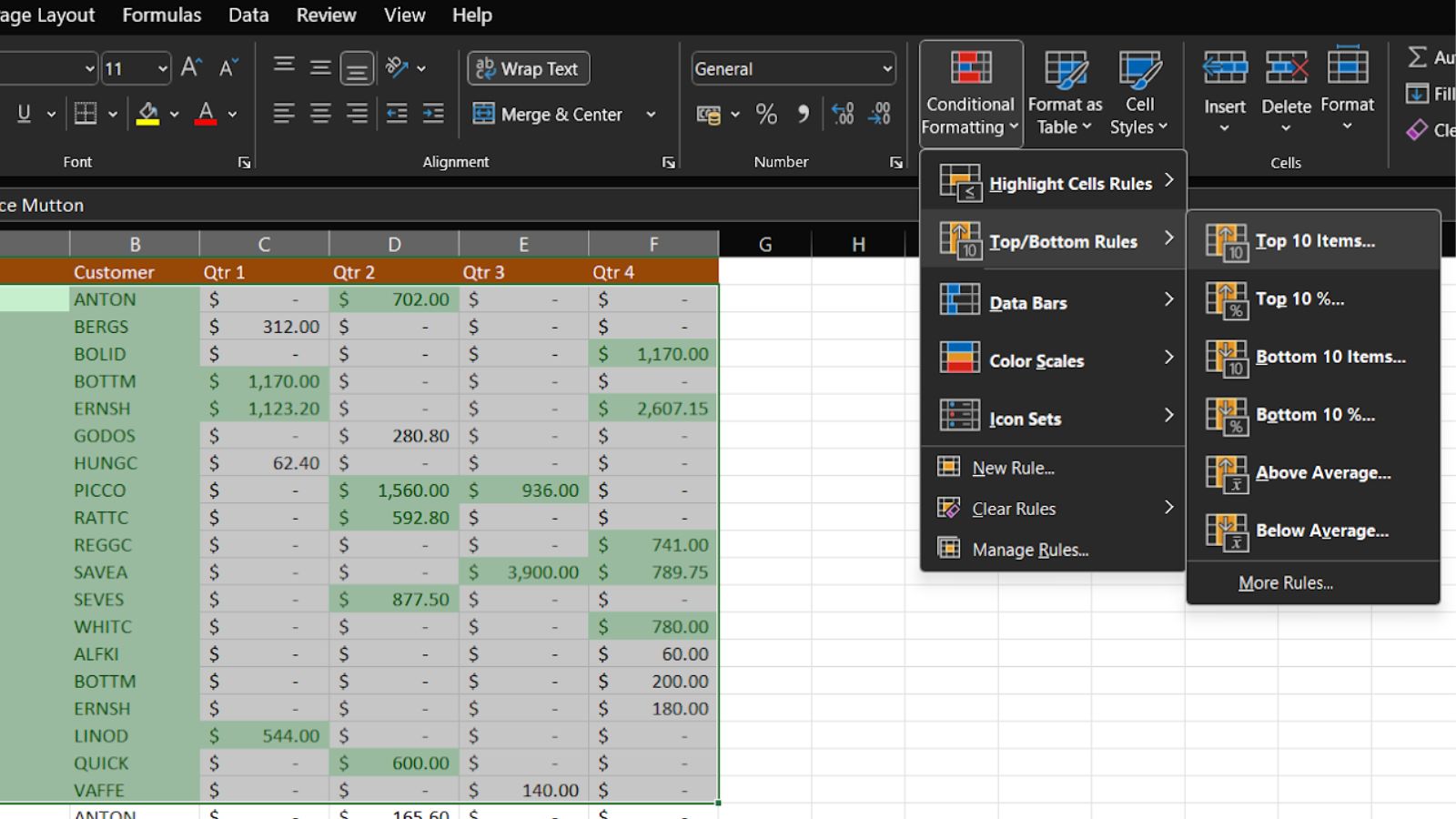
Conditional formatting quickly loses its analytical utility when applied recklessly to an entire worksheet. If every single data cell receives a background color, an icon, or a data bar, the underlying visual hierarchy instantly disappears. The reader can no longer distinguish which signals deserve immediate human intervention and which represent normal operational background noise. Furthermore, multiple overlapping rules can create unpredictable visual conflicts. In standard spreadsheet environments, conditional formatting rules are evaluated according to a strict order of precedence, meaning conflicting rules require careful management to prevent misleading output.
A restrained, minimalist design almost always yields superior results. Strong visual emphasis should be strictly reserved for genuine exceptions, critical operational thresholds, or patterns that demand immediate action. Routine, expected values should retain neutral formatting so that meaningful signals remain visually distinct and easy to isolate. It is also wise to verify that formatting rules continue to function correctly after new rows are inserted, formulas are updated, or data ranges expand organically over time. A rule that functioned flawlessly on last month's dataset may fail to reflect the structural reality of a newly redesigned worksheet.
Conditional formatting makes hidden patterns vastly easier to perceive, but enhanced visual visibility is never a substitute for genuine analytical explanation. A brightly highlighted cell may indicate a critical anomaly, an innocent data-entry error, a legitimate business exception, or a significant emerging trend. The formatting rule itself cannot determine which of these explanations is accurate. For this reason, conditional formatting functions best as the foundational first step in a thorough investigation. Once an unusual value or cluster becomes immediately visible, the analyst can dive into underlying source records, cross-reference related variables, and determine what the pattern actually means for the organization. The strongest professional spreadsheets use formatting deliberately to turn dense, intimidating data tables into clear visual representations of the questions the data was built to answer.